This document uses age-adjusted death rates from the National Center for Health Statistics for the years 1900-2018 to demonstrate good data visualization principles. Clutter is removed and a coherent message is communicated to the audience.
fig, ax = plt.subplots()for cause, group in df.group_by("Cause"): ax.plot(group["Year"], group["Age Adjusted Death Rate"], label=cause, linewidth=2.5)# ax.spines["top"].set_visible(False)# ax.spines["right"].set_visible(False)# ax.tick_params(length=0)ax.legend(title="Cause")# ax.set_title("Initial Rough Plot")plt.show()
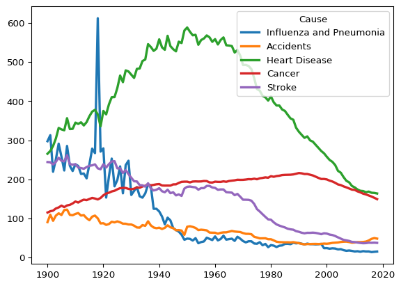
There’s a lot going on here, not to mention a legend that is in the way. Instead of looking at all five causes of death in the data, let’s focus on a single disease.
Plot Heart Disease
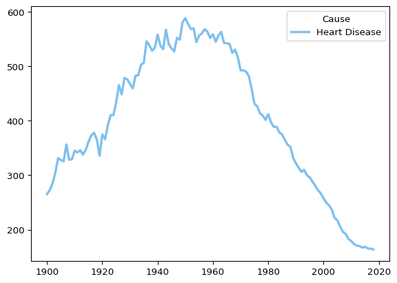
Let’s subset for heart disease and see what that looks like.
Code
# Subset for heart diseasedf_heart = ( df .filter(pl.col("Cause") =="Heart Disease"))# Initialize the plotfig, ax = plt.subplots()# Plot the segment for years <= 2000 in skyblueax.plot( df_heart["Year"], df_heart["Age Adjusted Death Rate"], linewidth=2.5, label="Heart Disease", color="#7EC0EE")ax.legend(title="Cause")plt.show()
This makes it easier to see what is happening with heart disease specifically. There is an interesting pattern here, which is that death rates from heart disease are lower than they have ever been since 1900, but that progress was not linear.
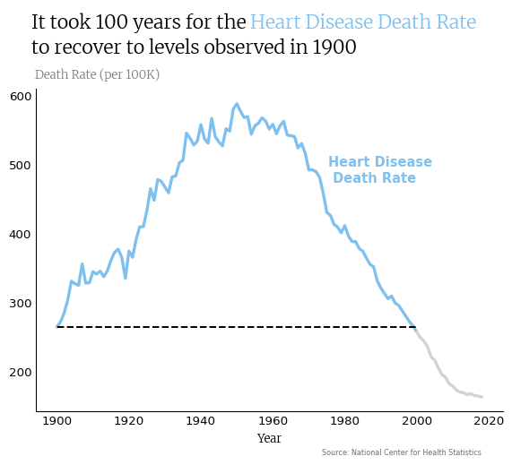
Let’s make a graph that highlights how long it took to recover to the death rate in 1900, which was 265.4 per 100,000 U.S. residents.
The graph below utilizes several methods to tell this story:
The top and right spines are removed.
The axis tick marks are removed.
Color is used to distinguish between the period of recovery to the death rate in 1900 and the period afterwards, when death rates are below the level observed in 1900.
A horizontal line is added to further distinguish the recovery to 1900 death rates.
The legend is removed in favor of direct labeling in the graph and in the title of the graph itself.
Code
# Split the data into two parts: before (and including) 2000 and after 2000cutoff = pl.lit("2000-01-01").str.to_date()df_old = df_heart.filter(pl.col("Year") <= cutoff)df_new = df_heart.filter(pl.col("Year") >= cutoff)# Load the font for the plotfont = load_font("https://github.com/google/fonts/blob/main/ofl/merriweather/Merriweather%5Bopsz%2Cwdth%2Cwght%5D.ttf?raw=true")# Initialize the plotfig, ax = plt.subplots()# Plot the segment for years <= 2000 in skyblueax.plot( df_old["Year"], df_old["Age Adjusted Death Rate"], linewidth=2.5, color="#7EC0EE")# Plot the segment for years > 2000 in lightgreyax.plot( df_new["Year"], df_new["Age Adjusted Death Rate"], linewidth=2.5, color="lightgrey")# Extract the rate for the year 1900rate_1900 = df_heart.filter(pl.col("Year") == datetime.date(1900, 1, 1))["Age Adjusted Death Rate"].item()# Add a dashed horizontal line from 1900 to 2000 at rate_1900ax.hlines( y=rate_1900, xmin=datetime.date(1900, 1, 1), xmax=datetime.date(2000, 1, 1), colors="black", linestyles="--")# Style the plotax.spines["top"].set_visible(False)ax.spines["right"].set_visible(False)ax.tick_params(length=0)# ax.set_title()# ax.set_ylabel()ax.set_xlabel("Year", font = font)ax.text( x =2000, y =475, size =11, s ="Heart Disease\n Death Rate", color ="#7EC0EE", weight ="bold", ha="left")# Adjust top marginfig.subplots_adjust(top=0.8, bottom=0.05)# Title with higlight_texttext ="It took 100 years for the <Heart Disease Death Rate>\nto recover to levels observed in 1900"ax_text( x=-10**4.45, y=720, s=text, fontsize=16, color='black', font = font, highlight_textprops=[ {"color": "#7EC0EE", 'fontweight': 'bold'} ])# Subtitlefig.text( x=.124, y=.825, s="Death Rate (per 100K)", size=10, font=font, color="gray")# captionfig.text( x=.6, y=-0.05, s="Source: National Center for Health Statistics", size=6, color="#6E6E6E")plt.show()
This all makes it easier for the viewer to notice that it took 100 years to recover to the heart disease death rate observed in 1900. Visualizations that are easier to read are more likely to be understood and acted upon.